
In my last post I said I was decidedly unhappy with the quilt, and had resigned myself to outlining the arches and sills with satin stitch to achieve more separation between the villa wall and the forest background.
That was done, and it's an improvement, but I'm still not thrilled, by any means. It may be the best it can be, though, with its inherent drawbacks (too much tonal similarity in the wall fabric and the forest panel, made worse by stippling the wall in a medium-brown instead of a light one). However, lesson learned, and you can be sure I won't make these mistakes again.
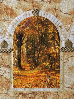
If you've hung in here with me this far (thanks!), here are some closeups (click to enlarge):


A third triple-arched-window quilt is planned, using the upper half of that same Timeless Treasures forest panel. This time the wall fabric will be chosen more carefully.

Have a great weekend!
Linda
I like the subtle differences between the indoor/outdoor choices because in life things are sometimes that way. This piece is a reminder of those types of views. I hope that makes sense or that I have conveyed my thoughts properly.....sigh ;-]
ReplyDeleteRhonda, you sure did, and thank you for giving me a different perspective on this. That's a profound point.
DeleteI am definitely not an artist and have no training whatsoever, but I wonder if you would like it better if there was a little bit of darker shading between the outer arch 'brick' area and the inner part of the arch. Perhaps a fine line of black or charcoal paint just along that line would add something to it? I"m sorry I'm not explaining it very well, but hopefully you get what I mean!
ReplyDeleteIt's interesting that you suggested this, because I almost darkened the arch lines instead of using a lighter thread. Fortunately I tested the idea on my vinyl overlay by tracing the lines with black dry-erase marker. It immediately became apparent that the dark lines would bring all the attention to the wall and arches, and the forest would visually fade. Since I wanted the forest to be the star of the show (and I'm not sure I pulled that off after all), I had to drop the dark line idea. Thank you for brainstorming on this, I very much appreciate the input!!
DeleteAlso meant to say that the dark lines also looked out of place because the light is coming through the arches from the forest, and I was afraid that anymore shading on the inner arches would make them more tonally similar to the wall and to the forest, making my tone problem even worse. I wish there was some way to test these theories in a photo program on the computer (there probably is) before making permanent changes. I need to look into that.
DeleteHmmm - I hadn't thought of a dark line. I was thinking in terms of darkening the entire inner part of the two outer arches to give an illusion of depth overall. Not making it really dark, but just a shadow. The light would be different 'inside' the arch so would make it appear darker than the outside because the sun wouldn't reach in there. If that makes one whit of sense whatsoever! I can't seem to explain it any better.
DeleteOh absolutely, it makes total sense. I was just afraid that if I shaded the inner arches it would make them the same mid-tone as the forest.
DeleteCould you try tacking on a piece of black tulle and see if that would be just enough?
DeleteGood idea, I will check that tomorrow (handily enough I saw a piece of black tulle on the studio floor right before I left it today!).
DeleteAhhh - perhaps it was a sign?
DeleteIt was definitely kind of the quilting muse, I'll say that. LOL Anyway, tested the tulle. Shading is definitely not the direction I need to move in, in fact if anything the inner arches need to be lighter, since my light source is sunlight coming the forest. Again, lesson learned. I'll just have to make better fabric choices. Tonal value has always been my biggest challenge. Most of my fabrics are mid-tones.
DeleteAh - the light source. I was confused as to where it was coming from - sorry! It was worth the exercise to test the theory though, if only to satisfy my curiosity.
DeleteI agree, for mine as well, and I am grateful that you were willing to brainstorm with me! The next one may be a bit of a challenge, too, only because once again the fabrics I have to work with are mostly mid-tones...I'll do what I can but there's this niggling little suspicion that the same issue may come up again. The wall will be darker, though, so that may save me.
DeleteI'm definitely no expert - nor am I any type of artist, but I'm having a great deal of fun playing about with landscapes. Grateful to you too, for what I've learned here. No classes to be had in my area so I have to rely on bloggers and books (and a whole lot of trial and error!!!)
DeleteOf course you are an artist! I've seen at least two of your pieces and you definitely know what you're doing. Great results on the Louisiana church and the quilt with the old car in it. You're not alone in your landscape quilt education...no classes for me, either, just learned from books and the internet. Mostly books. I've accumulated a pretty good library of them now and love to review them occasionally. Sometimes I pick up a technique I missed (or wasn't ready for) the first time around. And oh yes, trial and error for sure...best teacher ever!!
DeleteI think it came out really good. There is a good sense of perspective with the woods seeming to be far away. You may be sick of working on it and are seeing it from a negative point of view. I’ll bet if you put it away and take it out after a month or two you will love it. I love all the little details (kitty on the sill etc.)
ReplyDeleteNice job!
Thanks, Carol. I hope you're right!
DeleteWow! WOW!!! Linda, this is GORGEOUS. I am seeing it with fresh eyes that didn't see any of the progress, nor the mind's eye vision that you may have had, and it is absolutely beautiful. The details you put in (eagle, deer, little tree, keystone, column decor, etc.) add a lot of interest, and the overal coloring is very nice. I find the low contrast between the wall and the "outside" to be pleasing, calming, and holding a perfect autumnal harmony. Almost like I'm standing inside, but still directly communing with the beautiful nature outside.
ReplyDeleteGosh, thank you Lynette. You are helping me see it differently now. I used to not think as much about tonal contrast, but over the years I think maybe I've become too worried about my work not having enough "pop"...we hear that term so much now. But you have reminded me that a nature scene can be beautiful and valuable for its serenity, too, and can convey its own wow factor without dramatic contrast. Thank you so much. What a lovely message to wake up to this morning!
DeleteAwww - that's kind of you to say Linda! Started my day off with warm fuzzies...thank you. As for books - which one(s) is your favourite? I'm just starting out and would love to add to my library. (btw - rather than chatting here, if you'd rather - my email addy is marmic1954 AT hotmail DOT com).
ReplyDeleteNancy Zieman/Natalie Sewell's books and Joyce Becker's books were my original teachers and for additional techniques, I gradually added books by Gloria Loughman, Pat Durbin, Karen Eckmeier, Cynthia England, Kathy McNeil and Cathy Geier.
DeleteI have one of Nancy/Natalie's books - and two by Joyce Becker. And I follow Cathy Geier online. As for the rest, now I'm on a quest in hopes I can find them! Thank you.
DeleteYou're welcome! They all have different techniques, and it's a lot of fun to try them as well as combine some of them. Have fun!!
Delete