Friday, May 26, 2017

In (and Out of) the Water

This week the seascape digital panel (see last post) is on the machine.  (Click on any photo to enlarge.)


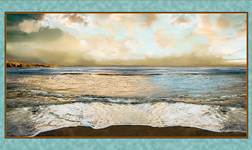
The water is being quilted with Sulky's holographic thread, giving it just the right amount of sparkle. I love this thread, which comes in several colors, and never seems to break as long as low tension, low-to-moderate speed, and a fine (lightweight) bobbin thread are used.


Wanting a break from increasingly dense stitching, I opted to try something that's been stewing in my head for a while: rendering a color-pencil drawing in fabric.

This is my working color copy, which had to be pieced and taped.
The original was a little too big for the scanner.


This started out as a "scribble drawing," if anyone remembers those from school decades ago (do kids still do that?), and it evolved into an abstract drawing titled "Fish out of Water."


For anyone too young to be familiar with the phrase "Fish out of Water," it refers to someone who is completely out of his/her element or comfort zone. (As you can see, this fish is out of its element in more ways than just being landlocked.)


Step 1 was to copy the drawing (in black and white) in poster format on the printer, 2 sheets x 2 sheets, and splice them on the back with transparent tape (first trimming some margins and overlapping others to match up the fronts).

[The drawing board is like a big clipboard, available at any art supply store.]


Step 2, using large tracing paper--which conveniently comes on a roll--or regular tracing paper taped together, to trace the drawing's outlines with a black Sharpie.


Step 3, retracing the outlines from the tracing paper (the black-and-white printer copy is removed but kept for reference) onto freezer paper, and then cutting out the separate sections of freezer paper to use as pattern pieces.

Step 4, carbon tracing the outlines--yes, more tracing!--onto a base fabric (in this case, buckram--a canvas-like fabric used to stiffen drapery headers).


Step 5, retracing the outlines on a piece of clear vinyl (see next photo).

[At this point you might be wondering, why so much tracing? Well, if you don't have a light box large enough or a glass-top table under which to put a light, and you're not willing to tape things up on a back-lit glass door to trace vertically, extra tracing is what you wind up doing. The thing is, I don't mind it that much--it's kind of relaxing.]

Step 6, positioning the base fabric (again, buckram here) as the bottom layer (I use the clips at the top as well as pieces of masking tape all around).

Step 7, matching the outlines on the vinyl overlay to the outlines on the base fabric, and then firmly clipping or taping down the top edge only of the vinyl. (Fabric pieces will be slipped in under the vinyl and positioned on top of the base.)

Step 8, choosing fabrics and cutting out the pieces by using the freezer paper patterns (ironed with the plastic/shiny side down onto the right side of the fabric). The fabrics can first be stabilized with paper-backed fusible web or fusible interfacing on the wrong side---or they can just be glued down directly on the base. (For curved pieces, I strongly suggest stabilizing, as the pieces may otherwise stretch and pucker when glued.) Of course, if paper-backed fusible web is used, the pieces will eventually be iron-fused to the base instead of glued.


To avoid gaps, a bit of a "seam allowance" needs to be cut outside the pattern lines wherever another piece is going to overlap (note: pieces are glued down beginning with the furthest in the scene and ending with the nearest, and trimmed or overlapped accordingly). I cut these "seam allowances" with pinking shears to avoid a hard line from showing through the overlap.

Unfortunately, though, once those "seam allowances" are glued/stuck down, they hide parts of the carbon-traced lines. That is why the traced lines on the vinyl overlay are necessary. It is the only way to assure accuracy in positioning the fabric pieces after some of the base lines get hidden.

Overall, the process is less time-consuming than it sounds. It probably took me longer to write about it than it does to do it. :)

Next time I hope to have all the pieces tacked down with mono-poly thread, and the seascape fully quilted.

Have a great weekend!

Linda

Thursday, May 11, 2017

Hang 'em High


This week, VVHH (very versatile handy husband) did me the honor of mounting a decorative curtain rod high over the twin bed, so that we could hang the 42 x 35 fall landscape quilt recently completed. (Click any photos to enlarge.)

I found the rod online, on sale, at Target. With its beautiful leaf pattern, it seemed perfectly appropriate for a landscape with trees. The brackets are adjusted to the shortest length, so the quilt hangs fairly close to the wall.

This is the first quilt (other than my initial amateur attempt) kept for myself.


After that, it was time to hang the Oriental piece (which I won't sell because of the wonky inner border). This rod has been up quite a while in the studio and comes in handy for temporary hanging before a sale or an exhibit. In between times, I'll leave this piece on display. Nobody will see it but us and an occasional guest (the studio doubles as a guest room, with a folding cot stored in the closet). Being small, this hangs kind of high, but doesn't get in the way when I'm using the old Singer (under cover in the photo).


Anyway, time for a new project! On impulse, I took this digital photo fabric panel from Artworks, Aqua Nuance, out of the closet.


My friend Janet gave me this for Christmas, and I've been hesitant to do anything to it other than quilting, since it's utterly breathtaking just as it is. But after staring at it for a while, I got out my favorite ship fabric...
This is only part of a curtain panel found at Goodwill for two dollars.
These ships have been used in two previous quilts.

...and cut out one of the ships, after backing it with paper-backed fusible.


Needs more wake...looks like it's going backwards!


Here it's being auditioned after a rough cut...


...and here it's been fussy cut, tweaked with paint markers and Sharpies, and then fused in a lower position than when auditioned. The ship's waves are playing better with the panel waves now that some white paint has been applied.


Then some rocks were cut from a Wilmington Wind and Waves fat quarter and added to the beach.


Now it seemed to need a third element, maybe somewhere on the cliffs at left. Maybe a castle? Out came the tracing paper.


Next, a Stonehenge fabric by Northcott Mills. And some scissors and a black Sharpie.


Then a heavy outline of Fray Check was applied to the finished castle (should have applied paper-backed fusible before cutting but forgot).


Far from perfect, but not bad.


Well this is a wonky photo! Late in the day is not good for me, at least for photos. Not enough light at left, either, but you get the idea.
Now it seems to need some seagulls, and something to "stop the action" at far right. Maybe a boulder. Still mulling that over.

Have a great weekend!

Linda

Friday, May 5, 2017

Stable-izing


The last few weeks in the studio were spent working on another "String-Me-Along" quilt top (pattern by Dodi Lee Poulsen, available at Fons & Porter's website). This time, purple is the popper. It would be more of a popper with white polka-dots instead of black, but this was the only cotton polka-dotted purple I could find online. And for some reason I was bent on purple.


Right after the photo was taken, I was reminded that it was the one-year anniversary of Prince's death. Coincidence? Anyway, Purple Rain it is.

After finishing the quilt top, the mood to sandwich and baste just didn't strike me. Instead the top was put aside for an Asian print fat-quarter that's been beckoning from the shelf for years.


This is only about 1/4 of the piece, but you get the idea. There were four different vases in it, each of which I backed with fusible and then carefully cut out for raw-edge applique.

[Note: I always turn down a corner when photographing a fabric, as the 'wrong side' sometimes works better than the 'right side' for a particular quilt. I keep these photos on file in my computer, categorized according to type, for quick reference.]


Several Stonehenge fabrics (by Northcott Mills) were auditioned, and these two, to the right and below, were chosen for the background and the inner border.


Apparently I'd failed to photograph the outer border fabric (also a Stonehenge) for my files, but here it is in the finished quilt photos.

29 x 19 inches


As you can see, there were some issues with squaring. I steam-blocked the quilt, first pinning the pink border as straight as I could get it--which wasn't very straight. Blocking did improve it, and of course after the quilt dried the outer edges were trimmed square and then bound, so ultimately the quilt is square. So, what was the problem? Well, the background fabric, which is not nearly as densely woven as the batiks I usually work with, should have been stabilized for such dense quilting. Lesson learned!

The next photo shows the texture a little better.


The foreground feathers were drawn freehand on tracing paper, re-traced on freezer paper, and thread-traced right through the freezer paper onto the quilt with a 100-weight (very fine) thread. They were then free-motion quilted over that fine thread tracing with a contrasting 40-weight variegated thread, and then re-stitched for more definition. (The feathers above the vase were quilted in a 100-weight thread that matched the background, for a much more subtle appearance than those in the foreground.)


The inner border features the only decorative machine stitch used on the quilt, a Greek Key stitch. This, too, would have benefited from some stabilization.

The vases were outlined with an applique stitch in clear mono-poly thread.


There was a bit of a fight with the fabric in the area between this vase and the feathers, and it won a couple of times. Again, not stable enough!

Speaking of stable(s), it seems we're in for a cold, wet race day tomorrow for the 143rd running of our famous Kentucky Derby here in my hometown (I'd bet on a mudder...poor horses!), but we've been lucky compared to a lot of folks in the U.S. Thoughts and prayers for all who have been or are being affected by destructive spring weather.

'Til next time,

Linda