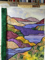
 After the votes, I was still torn, darn it!...so I went on and pulled fabrics in all 3 color families. So much for that "saving time and cuticles" theory ;). Anyway, that was where magenta fell out of the running, because it turned out that the closest colors I had were a deep red-violet (left) and a medium rose (right). The red-violet immediately brought all the purples too far forward (which one voter had said about the magenta) and the rose just looked wimpy.
 Then I auditioned the black fabric at left. Amazingly, instead of simply complimenting the black satin-stitching, it visually sucked a lot of the deep greens out of the quilt! It also looked a bit stark and lifeless against that pale sky fabric.
So out came the greens, below. Being a landscape quilter, I have lots of greens--batiks, leaf prints and tree prints. And while the dark- and medium-greens looked nice, they didn't make the quilt 'pop' as much as I'd expected.
That is, until I saw this next one, where just for the heck of it (you know how you start getting desperate and reckless after a while?) I'd thrown a somewhat wacky mottled yellow-green onto the design board. Mind you, I was only comparing these two greens at first, for the potential use of one or the other.
 But something clicked. I took the dark green off, and tried the mottled green by itself (no photo of that, aren't you glad? ;). But, no go. It looked too busy and it made the prints in the quilt recede and blend. So I put the dark green back on, and then started moving the two greens around to see which one looked better on the sides, which one looked better next to the sky, and which one complimented the print in the foreground. The sky looked better against the mottled yellow-green; everything else looked better against the dark green. But putting the dark green on the sides and bottom, and the yellow-green on the top only, just looked weird--like I had run out of dark green.
So below is the solution I came up with--and the finished quilt. Green not only won, it triumphed, with not just one shade but two! Fence sitting is a habit of mine that can drive me crazy, but in this case it actually worked out...I think. Maybe we should vote? Just kidding! :) What's done is done.
Linking up here with Leah Day's FMQ Friday. Check it out; she's got 3 beautiful free-motion projects going AND, come Wednesday, will have her newest Craftsy class, Free Motion Fillers Volume 2, up and ready!
Linda
p.s. Thanks again to everyone who voted. I'll be glad to return the favor any time!


That did work out perfectly! I love it, its a fantastic choice. Good for you - and post it as many times as your heart desires! :)
ReplyDeletePerfect!
ReplyDeleteThanks, ladies! :)
ReplyDeletethe two greens are perfect!! Beautiful!!
ReplyDeleteHello Linda,
ReplyDeleteMy vote is that you got it right. It looks lovely!
Love from England,
Muv
Perfect choice!
ReplyDeleteI still wouldn't be able to decide. The finished project is beautiful, great choice!
ReplyDeleteI love what you did. It's perfect.
ReplyDeleteThanks, everyone, I'm really relieved it doesn't look goofy to anyone (yet, lol). I had put a two-tone binding once before on a larger landscape, but it was two entirely different colors, brown and green. I'm starting to think two-tone might be the way to go on future landscapes as well. The sky is usually so different than the foreground, it's hard to find one fabric that coordinates really well with both. Thanks so much for your feedback!
ReplyDelete